Homepage redesign
Gousto is a recipe box company on a mission to become the UK's favourite way to eat dinner. Customers choose from a range of recipes every week and are sent the exact ingredients direct to their door.
The Gousto homepage is a core part of a prospects journey to signing up and must clearly articulate their proposition. Gousto had reviewed their market position and had determined they wanted to be known as the best recipe box for choice.
Hypothesis: Communicating our new value proposition, of being the best recipe box for choice, more prominently will attract more homepage visitors to complete the sign-up journey.
Year: 2021
Role: Sole Product Designer (UX/UI) covering the full end-to-end process, whilst managing 2 designers and hiring a third.
Team: Product Manager, FE engineer, Product Analyst, SEO Manager and Brand Designer.
Company: Gousto - Series D Scale-up in food tech
What have we learnt so far?
It was important to start by understanding what we had learnt from running previous AB tests. Note: I was not part of the team when these tests were run.
Homepage AB tests
-
Overall sign-up CVR was almost flat, despite a drop in CTR by 14.8% on the ‘Get Started’ CTA. The main CTA was made less obvious and was moved down the page.
-
The presence of a ‘Claim Discount’ bar during the experiment likely ‘saved’ subscription rate, particularly on mobile. There was a 13% uplift in CTR on the ‘Claim Discount’ banner.
-
Applying discount at 'Get Started' increased conversion rate by 9.1% for eligible customers.
Landing page multi-variant tests
-
‘No lock in’ subscription message had a negative impact on CTR, but on mobile this was outweighed by a rather large (but not quite significant) uplift in CVR.
-
Including social proof messaging (quotes from Joe Wicks and Fritha Quinn) increased CTR by 3.6%.
How to design a great homepage
I began researching into homepages to gather inspiration and understand best practice techniques for increasing CVR. With Gousto being a subscription service I looked at various online subscription companies to understand what information they showed to customers. This library of inspiration was then used to inform and inspire ideas during an ideation session.

Idea generation
I ran an ideation workshop with our cross-functional team focused on how might we best showcase our choice and variety on the homepage and improve discount visibility, given we knew how effective discounts were. We also focused our attention above the fold as I knew it was important for users to understand our proposition as soon as they land on the homepage.
Workshop structure (75 mins):
1. Overview of previous learnings from AB tests
2. Homepage inspiration - what makes a good homepage? Voting for the homepages which best showcase the product proposition in 5 seconds.
3. Crazy 4's (discount visibility) + affinity mapping
4. Crazy 4's (choice champions) + affinity mapping
5. Create the ultimate homepage

Pairing with brand
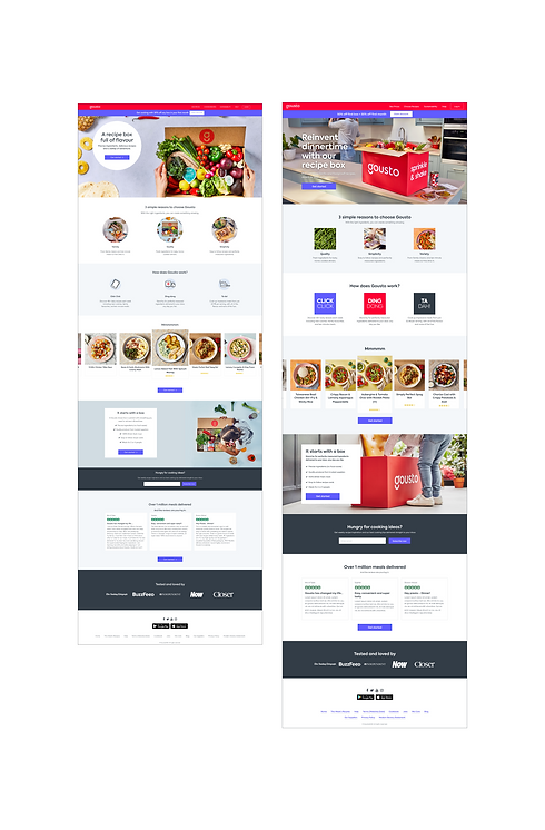
We made a refined list of ideas from the workshop to further develop which were focused on choice and variety. We ensured these ideas were as varied as possible to maximise learnings from the user testing. These ideas were then combined with ideas of how to showcase the discount.
Idea 1 - Background of multiple recipes overlaid with copy -> transformed into a storyboard idea
Idea 2 - Animating grid containing images and our Gousto patterns
Idea 3 - One image with statement hero copy
We used Figma to explore these ideas, with brand bringing in potential image assets and writing variations of copy and myself focusing overall layout and key interactions. We quickly discovered that Idea 1 was very overwhelming and instead I saw an opportunity to transform this into a storyboard idea which included an image with multiple dishes.
The 5 second test
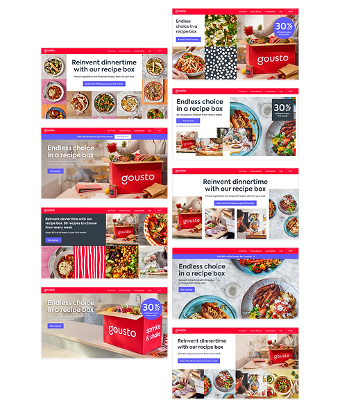
From my research I knew that users needed to understand our proposition within 5 seconds of landing on the homepage. Therefore, I conducted 5 second tests with our three concepts. Each participant would be shown each concept individually for 5 seconds, in a random order, and straight away asked what they remembered. This allowed me to see if the choice and variety message, as well as the discount, was resonating with users.
Idea 1 (the storyboard) best sold the story of Gousto and clearly showcased choice and variety. It was also the overall preferred design by participants. The discount was remembered easily when in the bar or in the grid format.
Based on the feedback for all three concepts I made a list of refinements to be made to idea 1:
-
Review imagery; keep red box image and the multiple dishes image; can we change the cooking image to show families/couples?
-
Change CTA to ‘Get started’.
-
Include discount in a bar or more prominently as part of the storyboard.
-
Use “Endless choice in a recipe box” copy - hits home choice further.
-
Increase prominence of 50 recipes sub-copy.
-
Include flexibility of cancelling any time; a few participants commented on this being a big selling point.

Below the fold
Having focused on getting above the fold right first, I then started to develop the rest of the page. Working with analytics and conducting evaluative testing I discovered:
-
The page was too long, and had repetitive content
-
Majority of users never scroll past ~50% of page.
-
~30% of users do not scroll at all
-
The three pillars of Gousto (variety, quality and simplicity) were liked and understood by users
-
Price per serving was important and could be made more prominent
-
'How it works' section had mixed responses
-
Users loved the recipe carousel - it really hits home what Gousto has to offer
-
The trust pilot reviews added no value and instead an overall rating was suggested as being more useful.
I was then able to turn these insights into a list of changes to make to the current homepage.

Adapting for build
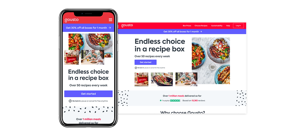
Working with our engineer to build the new design we discovered that having scattered overlapping imagery for the storyboard was more difficult than first thought to build responsively. For the purpose of the MVP we adapted the design to have one hero image and a sequence of smaller images that would scale responsively.

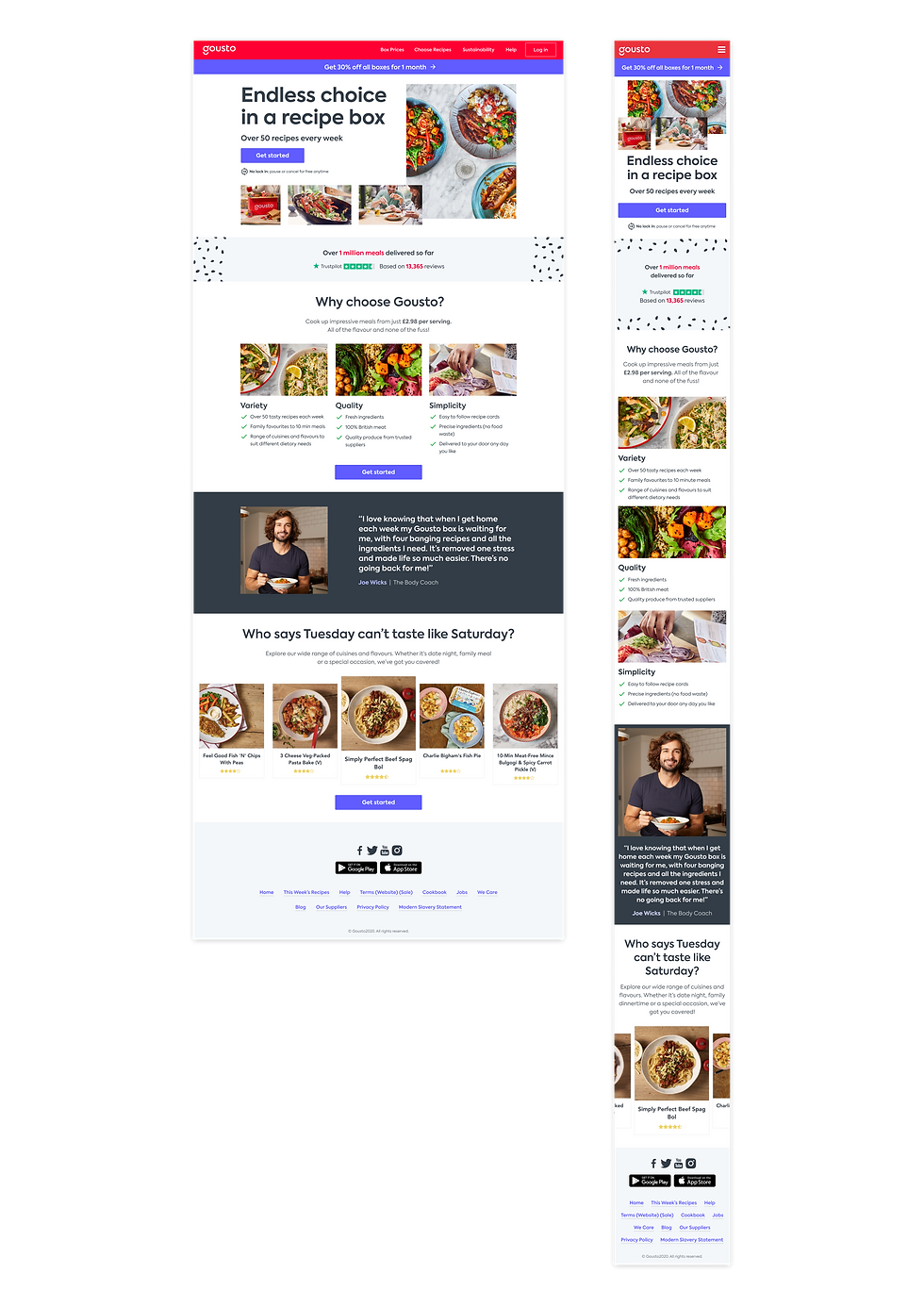
The solution
A new homepage that best sells the Gousto proposition within 5 seconds, highlighting clearly the breadth of choice and variety we have through copy and imagery. The discount is clearly shown through the use of the sticky bar on desktop and bottom sticky CTA on mobile.
Leaning on quantitative and qualitative research after the hero section we have the trust pilot overall rating, one simplified 'Why choose Gousto?' section, a standalone Joe Wicks quote and the recipe carousel.
AB test results
We ran an AB test of the new design with a 50/50 split for new users. The results exceeded our expectations with an 8.7% increase in overall sign-ups, with 99% significance, as well as an increase in engagement with 7.7% increase in CTR.
4.8% increase in overall sign-up conversion rate
Isolating the homepage by itself saw a +9.5% on mobile and +6.8% on desktop.
Generating £4.2m profit over a year from sign-up
Increase of 28,800 sign-ups a year.
7.7% increase in click-through rate
+6.8% on mobile and +12.1% on desktop
The ‘Why Choose Gousto’ section really resonated with users, generating 21% of click-throughs
Previously CTR was 9.7% on the ‘Box Description’ section and 2.8% on Trustpilot, totalling 12.5%
On mobile, 28% of users scrolled over 80%
Previously only 11.4% of users scrolled this far.