
Message builder
Triptease is a SaaS business with a range of products that hotels can purchase to increase their direct bookings. Targeted Messages is one of these products which allows hoteliers to add marketing messages easily to their website.
The Message Builder is what hoteliers use to create full screen exit-intent marketing messages. These messages can have optional targeting conditions applied. The conversion rates of messages with targeting are much higher due to them being more personalised. The majority of clients are not creating many messages and are not using the targeting conditions.
Improve the usability and scalability of the Message Builder and increase the usage of targeting conditions to ultimately increase direct bookings for hoteliers.
My role
Product Designer (UX/UI) covering the full end-to-end process.
Team
Product Manager and 4 in-house software engineers. Working closely with Customer Success and Marketing/Brand.
Assessing the current builder
I started by interviewing clients and reviewing the current builder to find pain points or parts that worked well:
- Full screen takeover was effective in keeping users engaged in creating a message.
- Targeting conditions were very hidden and often missed by users.
- Colour was used to group targeting conditions which was not very scalable.
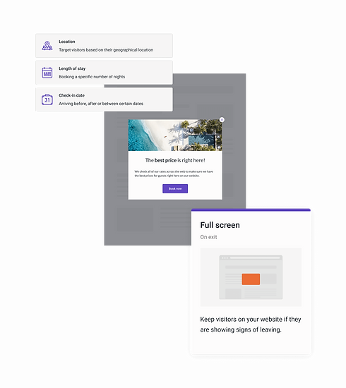
- The "browser behaviour" targeting was very powerful as it allowed users to determine which page to show their message on but was very lost amongst the other conditions.
- The placeholder website behind the message preview was confusing for users.

Breaking down message creation
Working with the Product Manager we discussed the future vision of the Message Builder and how it would scale to include more message types instead of just "full screen". This would mean building features like ability to specify how a message should be triggered, message scheduling and more targeting options.
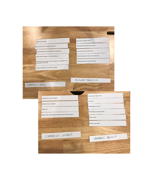
I ran a card sorting exercise, including both existing and future features, to help establish how the builder should be reorganised and structured.
The outcome was a pattern of key areas:
- message content
- message design
- audience/targeting
- details/behaviour
The order of these sections differed between users, some starting with design, others with details. Placement of actions like "name your campaign" also varied.
Guided flows are hard to build
Researching other message creation tools I found some used a guided step-by-step flow and others were fully interactive, letting you directly edit the message itself by clicking on it. I thought a step-by-step flow could be a great way to ensure users use the message targeting.
When looking at the technical feasibility of these ideas with the engineers I discovered how hard it is to build wizards or guided flows. Wizards often involve hijacking the browser's user history which is gnarly and increases testing complexity. Therefore, we decided against this and moved towards considering an improved 'tabbed' design or a continuous page.

Testing ideas early
Having established which ideas were more technically feasible I started sketching wireframe flows on paper. I then used existing components to quickly build prototypes of these in Figma to try and test what would be the best overall flow and format for users.
Testing the different prototypes I found that putting the targeting section first and removing the modal to reveal the conditions gave users greater visibility into the targeting conditions. However, users with multiple hotels were wanting to start by selecting which hotel their message was for. Having the content section last in the flow gave users confidence in the message they were publishing. The modal with the message name at the beginning was a little jarring and could be improved.
The overall flow that worked the best was:
- Details; changed to "behaviour" - opportunity to move 'message name' here now this is the first section
- Targeting; changed to "audience" as this resonated better with users
- Content; changed to "design" as this captured the page covering content and theme.
Video of a prototype shown below. I used initial components from our UI which I did not style - the company later underwent a rebrand where I updated the look and feel across our platform.
Build or borrow?
With a high level flow decided, I began looking at the detail of the builder, in particular the interactions for the various targeting conditions.
For check-in date targeting we would need a date picker. Having a small team, and with the large surface area of the project, we decided we would be better off restyling an existing component rather than building our own from scratch. Airbnb had a readily available date picker that worked perfectly well so we took this and restyled to match the new UI.

Styling
The business was going through a rebrand so we need to align the builder with the new branding. The iconography was overhauled after receiving feedback that the current icons were quite ambiguous. I removed the unnecessary use of colour for the icon categories and instead made all the icons purple; our new interaction colour.
I created a new simplistic illustration style for the full screen message type, and another to represent a web page to use behind the the full screen message preview in the design section.
Releasing early access
We selected a group of users to release an early access version of the new message builder to. This allowed us to get very early feedback on key decisions and help further improve interactions. For example, no longer pre-selecting 'all hotels' and refining the page selection tools.

The solution
A new Message Builder split into three main parts; Behaviour, Audience and Design.
- Behaviour; where the message should show
- Audience; who the message is for
- Design; what the message should say and look like.
Using a centred bar with clear tabs helped to inform users there are three key stages. Removing the modal on the Audience page and instead showcasing the targeting conditions upfront made users aware of the different ways to target their audience.
The new 3 stage format allowed for more flexibility for future message types to be added which would behave differently. Improving the hierarchy and structure of the content, adding in subheadings, meant it was easier to understand and use the builder.
125% increase in engagement
Whilst the number of clients doubled over time.
65% of clients now use targeting
Clients who use targeting create more messages on average and are less likely to churn.
Systems thinking
The new design of the Message Builder was scalable and future features were easily added:
- New message types which use the builder; nudge message, email capture, undercut, price check and crisis management.
- Message scheduling in the 'behaviour' tab.
- Additional targeting conditions in the "audience" tab including likelihood to book, party size and referral website.
- Variant testing and ability to add your own custom design in the "design" tab.

More projects

Gousto
Homepage redesign
Redesign of the Gousto homepage to best showcase our choice and variety. Result was a 4.8% increase in overall sign-up conversion rate, generating £4.2 million profit over a year from sign-up.


